
Picture a customer who wants to book you. She is blind, and she uses a screen reader, software that reads a web page out loud. She lands on your site, tabs down to the contact form, and her phone says: "edit text. edit text. edit text. button." No names, no hints, nothing to tell her which box is the phone number and which is the message. She tries for a minute, gives up, and calls someone else. You never find out she was there.
That is what an inaccessible website does. It turns away people who already wanted to hire you, quietly, and it does it every day. It also carries a risk most small business owners have never heard about until a letter shows up: website accessibility lawsuits, which hit a new high in federal court last year. The good news is that the fix is not mysterious, it is not expensive compared to the alternative, and a properly built site does it from day one. Let me walk you through what "accessible" really means, the six mistakes nearly every site makes, and how to check yours in about a minute.
What "accessible" actually means
An accessible website is one that people can use no matter how they get around the web. Roughly one in four American adults lives with some kind of disability. Some are blind and use a screen reader. Some cannot use a mouse and move through a page with the keyboard alone. Some have low vision and zoom the page to twice its size, or need strong contrast to read text at all. And a lot of your customers are simply older, reading on a phone in bright sunlight.
The yardstick everybody uses is a standard called WCAG, the Web Content Accessibility Guidelines, and the level that matters for a business site is WCAG 2.1 AA. You do not need to memorize it. It boils down to four plain promises: people can see and hear your content, they can operate every button and form without a mouse, they can understand what is going on, and the site works with the tools disabled people actually use.
Almost every website fails, and it is the same six mistakes
Every year a nonprofit called WebAIM runs an automated scan of the home pages of the top one million websites. In February 2026, 95.9 percent of them failed at least one basic check, with an average of 56 errors per page. Those are not small hobby sites, either. These are the most visited sites on the internet.
Here is the part I find encouraging: the problems are not exotic. Six simple mistakes make up 96 percent of everything the scan finds.
In plain English: low-contrast text is light gray words on a white background that a lot of people simply cannot read. Missing alt text means a photo has no written description, so a screen reader announces "image" and nothing else. Unlabeled form fields are the problem from the story above, boxes that show gray example text that vanishes the moment you start typing, with no real label behind it. Empty links and buttons are icons, like a phone or a menu symbol, that carry no words, so the screen reader just says "button." And a page with no language set gets read aloud with the wrong pronunciation.
Notice where the top three land. Contrast, images, and form labels are exactly what stands between a customer and your contact form or booking page. The parts of your site that make you money are the parts most likely to be broken for someone.
The lawsuits are real, and they are not only for big companies
I want to be careful here, because I build websites, I am not a lawyer, and this is not legal advice. But the numbers are public, and every business owner deserves to see them.
The Americans with Disabilities Act requires businesses open to the public to be accessible to people with disabilities, and courts and plaintiffs have applied that to websites for years. In 2025, 3,117 website accessibility lawsuits were filed in federal court, up 27 percent from the year before, according to the law firm Seyfarth Shaw, which tracks every filing. Count state courts too and UsableNet, another tracker, puts the total over 5,000.
Restaurants, shops, hotels, and local service businesses all show up in these filings. New York, Florida, and Illinois see the most cases, but the person filing only has to visit the website, so where your business sits does not protect it. Most cases never reach a courtroom. They settle, the business pays its own lawyer on top of the settlement, and then it still has to fix the site, because the site is what started the whole thing. One more number worth knowing: more than 1,400 of last year's suits were against companies that had already been sued once. A quick patch that does not fix the underlying code tends not to hold.
Why the one-click "accessibility widget" is not the fix
You may have seen ads for a little widget you paste onto your site, a floating icon that promises to make it compliant overnight for a monthly fee. It is tempting. I understand why people buy them.
The trouble is that a widget sits on top of the page. It does not change the code underneath, and the code underneath is what a screen reader actually reads. If your form fields have no labels, they still have no labels with a widget on top. In 2025 the Federal Trade Commission ordered one of the best-known widget companies, accessiBe, to pay $1 million for claiming its product could make any website meet the WCAG standard when it could not. Plenty of businesses running widgets have been sued anyway. Real accessibility lives in how the site is built, not in a plug-in bolted on afterward.
What a properly accessible site looks like
The good news is that accessible design is mostly just good design done carefully. Here is a contact form we built for a roofing company in North Georgia.
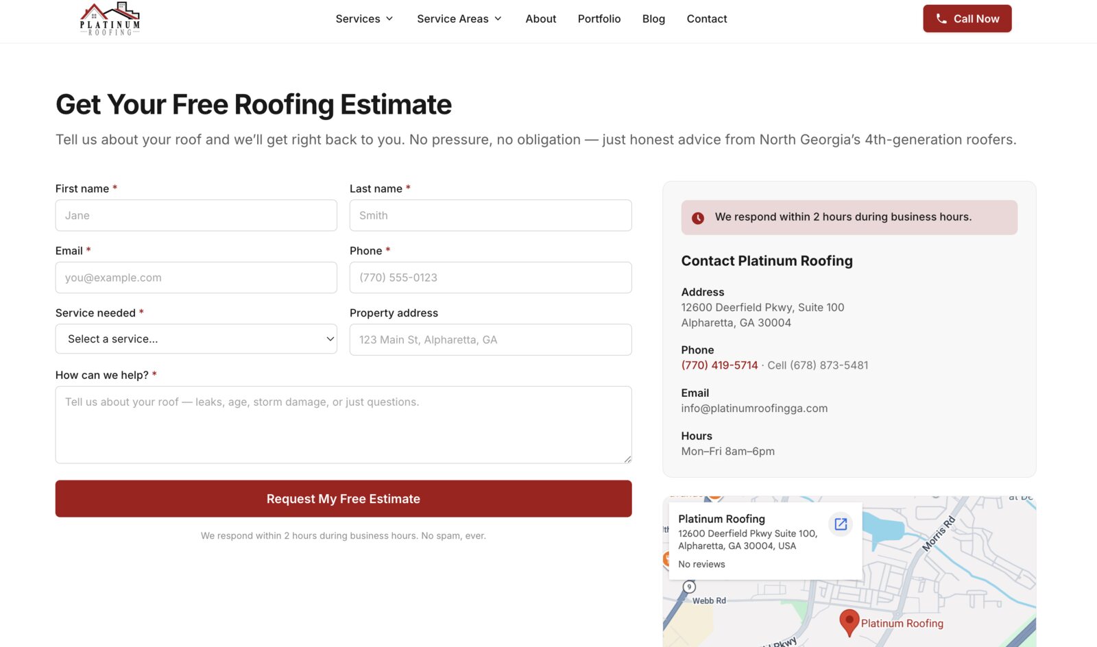
The checklist behind a site like that is not long:
- Every form field has a real label, not just gray placeholder text
- Text has strong enough contrast to read in sunlight and at a glance
- Every meaningful photo has a short written description
- Every button and icon link says what it does
- The whole site works with the keyboard alone, with a visible outline showing where you are
- Headings are used in order, so a screen reader user can skim the page the way you skim with your eyes
- Error messages say what went wrong in words, not only in red
The one-minute accessibility check
Try three things on your own site right now. First, put the mouse aside and press the Tab key over and over: can you see where you are on the page, and can you reach and use your booking or contact button? Second, zoom your browser to 200 percent: does the page still work, or do things overlap and disappear? Third, click into your contact form and start typing: if the hint text vanishes and there is no label left above the box, that field is invisible to a screen reader. For a quick score, our free Website Grader runs Google's own accessibility audit on any page.
An accessible site is a better site for everyone
Here is the part that gets lost in all the talk about lawsuits. The same fixes that help a blind customer help everyone else too. Strong contrast is easier to read on a phone outside. Clear labels mean fewer abandoned forms. Big tap targets mean fewer mis-taps from thumbs. And the structure that makes a page readable to a screen reader, real headings, descriptive image text, buttons that say what they do, is the same structure Google and the AI answer engines read when they decide what your page is about. We dug into that in our piece on getting recommended by ChatGPT and Google's AI. An accessible site tends to rank better, convert better, and reach more people, which is a pretty good deal for doing the job right.
Fix it in place, or build it right from the start?
If your site is in decent shape otherwise, an accessibility audit and remediation is usually the right move: we test the site against WCAG 2.1 AA with both automated tools and a real keyboard and screen reader, then fix what we find in the code. For most small business sites that runs $300 to $600, which is a small fraction of what a single demand letter costs to answer.
If you are on a template platform, you can fix some things, like your alt text and your colors, but not the code the platform controls, so some problems are simply out of your reach. And if the site is due for a rebuild anyway, that is the cheapest moment to get accessibility right, because it is built into the foundation rather than retrofitted. Every site we build is made this way from the start: real labels, contrast checked against the standard, and tested with the keyboard before it ever goes live.
The bottom line
Nearly every website on the internet has accessibility problems, and nearly all of them come down to the same handful of fixable mistakes. Fixing them means more customers can actually use your site, your search visibility gets stronger, and you are far better protected from a lawsuit that has nothing to do with how good your work is. It is one of the few website improvements that pays off in three directions at once.
If you would like a straight read on how your site measures up, run it through the free Website Grader, or give us a call at 770-769-5239 and we will walk through it with you. If it turns out your site is already in good shape, we will tell you that too.